

I was a first-semester freshman at the University of Texas in the fall of 1971, doing my best to maintain some degree of equilibrium on that huge campus. My home, and that of 3,200 others, was Jester Center. While walking through an outdoor corridor on its east side, who did I see coming toward me but Darrell Royal. Coach of the Longhorns 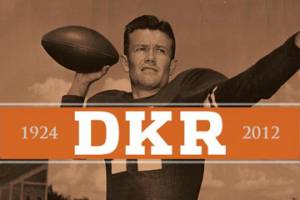 for the past 14 seasons (national champs in 1963, 1969 and 1970), he was a titanic figure. He was alone, and so was I. Closer and closer we got, our eyes locked. He was smiling, friendly. Before we passed and went our separate ways, he said, “Hello. How are you?” The great DKR was that kind to a lowly freshman. I knew then, it was an encounter I would never forget. In fact, I mentioned this to him many years later during an interview. Of course, he had no recollection of it.
Royal did more than coach football; beginning in 1962, he took on the role of athletic director and held it until 1979—three years after he quit coaching at age 52. He made two aesthetic decisions that are still with us today. The first one, in my view, was a major success. The second—remember, these are subjective matters—was not. Let’s take them in order.
Darrell and Rooster
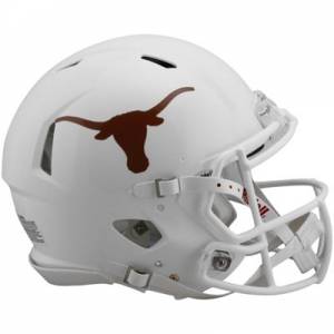 In early 1961, he met with Austin sporting-goods magnate Rooster Andrews. (Andrews, as you may know, had been the manager and a part-time, drop-kicking place kicker at UT from 1943 to 1945.) Royal wanted a logo to adorn the football helmet. Andrews contacted a graphic designer, whose name has been lost in the mists of time. What he/she and Andrews came up with pleased Royal greatly: the now very familiar Longhorn logo. It dispensed with the anatomical details used on previous versions going back as far as 1913. This design was simple, uncluttered, bold and strong—and yet understated. Even our rivals in College Station, Norman and elsewhere would admit that it was classy. The newly designed helmets made their debut out on the west coast on September 23, 1961, a 28-3 defeat of the California Golden Bears.
Whether Royal knew he was creating the Longhorn “brand,” it has become just that. Symbol of the University of Texas, it is known far and wide. I have seen more than one survey of the best-looking helmets in college football—again, obviously a subjective matter—and it always comes out at or near the top. I can see why. Am I a homer? I contend that if I were born in North Dakota or Georgia or Hawaii or Vermont, I would still feel the same.
Light, dark, light and then dark again
He should have left well enough alone because he screwed up the very next year. UT’s colors since 1885 have been orange and white, but the shade of orange has varied. It was rather bright up through the early 1920s. Since the jerseys were said to have faded over the course of a season and the big UT-A&M game was always the last on both teams’ schedules, the Aggies found a way to gig their Southwest Conference cousins by calling them “yellow bellies.” The term, I tell you, still has currency among some of the A&M faithful. So E.J. “Doc” 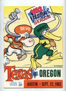 Stewart, a strutting martinet of a coach, took it upon himself to institute a darker shade, calling it “burnt orange.” This really did not last long as the Horns’ jerseys were again lighter and brighter by the mid-1930s. So it remained during the tenures of Clyde Littlefield, Jack Chevigny, Dana X. Bible, Blair Cherry and Ed Price, and during Royal’s first five seasons.
I am dating myself here, but I remember the ’61 team’s home unis. That bright jersey, worn by Jimmy Saxton, Mike Cotten, Tommy “T-Bird” Ford, David McWilliams (destined to coach the team from 1987 to 1991), Johnny Treadwell, Scott Appleton et al. was sublime. But the coach somehow found fault. He had a conversation with Littlefield (UT’s track coach from 1920 to 1961) who told him the color used to be darker. That’s all he needed to hear. He unilaterally made a change, and so when Texas hosted Oregon at Memorial Stadium on September 22, 1962 (25-13, Horns) the fans got to see for themselves. Five years later, the Board of Regents gave it their imprimatur, holding that “Pantone 159” is the school’s one and only shade of orange.
I have never liked it and I never will. It’s an ugly color, almost brown. Maybe you think I exaggerate. I was watching a UT basketball game on television about 20 years ago when I heard the announcer mention that the Horns were wearing “brown.” Admittedly, the guy was an idiot and should have known 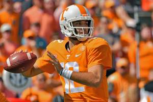 better, but he said it. Other schools that feature orange prominently include Miami, Oregon State, Syracuse, Clemson, Florida, Illinois, Virginia Tech, Sam Houston State and Tennessee. Ah, the Vols! Now, that is a bright and beautiful orange. Not a single person in Knoxville would try to change it in any way. I envy them and think of what we had. It has caused me a lot of emotional pain over the years.
A 1960s protest
I am far from alone in holding this view. Many people complained when the new color was unveiled. In 1966, a group of students and alumni presented a petition to the Board of Regents urging them to ditch the “dark, muddy and murky burnt orange” Royal had foisted on them and return to the old (better) 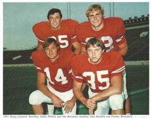 color. “The winds of whim and aesthetic taste must not be permitted to overturn the university’s tradition,” they declared. They pointed out that in 1950 the Regents had adopted a university seal featuring a color that resembled a certain citrus fruit.
Color, I have read, is vibration and energy. The hypothalamus of the human brain processes sensory inputs such as color and translates them into emotions. We have innate reactions to colors; this has been pseudo-scientifically proven. There are exuberant colors, muted colors, hot and cold colors. Combine that with a university’s athletic teams, and passion is sure to be aroused.
The aforementioned interview with DKR covered a lot of ground, this included. We talked about both the Longhorn logo—two thumbs up!—and the changed color in 1962. He asked me which I liked better. I told him in the nicest way possible that what we had before was superior. The issue was brought back to me recently when I attended a UT alumni gathering here in Seoul. After the socializing, dinner and speeches, the hosting Korean Alumni Association presented Texas jackets to Greg Fenves (university president), Jay Hartzell (dean of the business school), Clay Johnston (dean of the medical school) and numerous others. What a splendid piece of clothing this was, in bright orange and white! None of that ugly brown stuff, no Pantone 159. This, friends, was a huge difference—and all for the better. I have a feeling, though, that UT’s Office of Brand, Trademarks and Licensing was irked. A cease-and-desist letter may have already been sent out.
I realize that some people just love what Royal did back in 1962 and have no wish to change it. But as an alumnus and a person who was on or around the campus for more than three decades and has studied Texas sports history in depth, I figure my opinion deserves to be heard. The Longhorn logo is excellent—on that we can all agree. Burnt orange, however, reeks.
26 Comments
Another eloquent message about one of the loves of your life-UT. Once again, your research of everything UT comes through loud and clear. The burnt orange color does take some getting used to. My daughter was in the Longhorn Band, so I grew to love it. Great article, Richard.
Thank you, Tammye! But wouldn’t you have loved it more if Darrell had not meddled with the school colors? We had bright and beautiful, and traded that for this semi-brown…yuk.
Another great lesson in history, thanks Richard for your prospective. I went to junior high and high school in the Austin area and was a regular on the campus. From the basketball courts to parties and of course the Texas state track meet. I’ve always thought they could have done better with the colors but remain a loyal Longhorn to this day. Great piece Richard
You and me both, KD! Loyal Longhorns, but wish Darrell would have refrained from messing with school colors.
Interesting article and very well written. One of our clients, a resident of Virginia, has long been an artist whose commissioned work hangs in many offices on the UT campus, including ones of Bevo located in the training facility and in the main athletic hall. The burnt orange and cream closely resemble the colors found on most longhorns, including the current young one (with growing but short horns) serving at our mascot. I have one of her “Bevo” paintings hanging in our home. It is this one reason alone that I have come to appreciate the color – it is authentically “correct” even though it is not too palatable to most observers. Sadly, thanks chiefly to the Oregon Ducks, the term “school colors” has become archaic.
Bettye, you are a perspicacious woman! You and others have pointed out that the burnt orange has some resemblance to the coat of a Longhorn cow, and this is very true. I have never considered it before, but I think it has some validity. I can swallow this more easily than DKR saying he wanted to return to the “original” color. And your point about Oregon is so very true. I read a recent comment by the UT athletic director Chris Conti. He is looking for wiggle room so the Horns can experiment with these outlandish colors and combinations. You may know that the basketball team sometimes wears BLACK…Lord, have mercy!
Enjoy your articles and this one is no exception. I graduated Bryan Adams in 1961 and joined a large number of fellow Cougars in Austin. That fall we had our hearts broken by TCU (remember the cockroaches who fall into things and mess them up).
Wholly concur with you on the Longhorn logo but not on burnt orange which the team proudly wore to our first national championship in 1963. As previously noted, burnt orange and cream is much closer to colors found on real longhorns. I liked it from the first year much more than the garish Halloween orange that just looked like another Tennessee jersey. Another plus for burnt orange, it’s closer to the color of a football and makes it a tad more difficult to discern when being carried.
Joe, thanks for reading and issuing a comment. I do remember DKR’s comments about the Horned Frogs and “cockroaches.” I wish to say to you what I said to Bettye above–the correlation between burnt orange and the coat of a Longhorn cow makes a lot of sense. And as you said on the BA Facebook page, I seem to be in a minority, hahaha. But I would respectfully disagree with your characterization of UT’s colors pre-1962. Not garish, but bright, beautiful and exciting. As for the ball carrier’s jersey matching the ball, that applies only for home games since we wear white on the road.
Excellent article Richard: I didn’t go to UT, but I played High School and Jr High Football in Austin. At JE Pierce Jr High we were undefeated city champs. At John Reagan high, our freshman team was undefeated District Champs. At Round Rock High we were district runner ups. All these teams patterned everything we did off the mighty Earl Campbell led TEXAS LONGHORNS. At Reagan we ran that wishbone like music. I guess I was somewhat brainwashed, because I love that burnt orange! Beautiful color, and when you see it you think LONGHORNS. it is unique in football, and the helmet logo is perfect!
Abner, you played at Reagan? Didn’t know the Raiders ran the wishbone, though. So you agree with the majority here, that burnt orange is preferable. I am outnumbered, but I have to stand my ground.
Interesting article, sir. Thank you for letting me know a little about the UT football history!
Thanks, Anthony. I doubt people in Bloomington are as passionate about college football as those in Austin.
Relax Richard, that burnt orange is unique among uniform colors. It is a good history lesson for those of us who came after the great Darrell Royal.
We agree that it’s unique, Coach. And I should have mentioned that some of those shades of orange are awful (IMHO). Syracuse–ugh!!
Whatever shade of orange- burnt, lighter, or light,- i can say that i now understand the longhorn logo. I honestly dont know about its meaning- though i have seen it many times- in your caps, shirts and even in the things you sent to the Philippines! Thank you RAP for this piece of information. Surely, i enjoy reading this article.
Dr. Cornel, this is another one of those stories that a non-American would find baffling. I thank you sincerely for reading and making a comment.
Quick story: BA65’ers Steve Scott, Nathan Brandon and I were invited to UT for a recruiting trip after football season. Mrs. Brandon drove us to Austin. We stayed overnight, toured the facilities, and met Coach Royal. It became clear later that Texas was after Steve, and that Nathan and I were along for the ride. Still a great story. Like going to the mountain top! \m/
1965? That was the beginning of Royal’s 3-season swoon, when he should have been integrating his team.
If they played better, burnt orange would be beautiful right now!
I would rather they play better AND go back to the bright orange.
Hi Richard
Thank you very much for your invitation to visit your blog.
Here we can find interesting articles about sport and history. In particular, articles about Jikji are an important book about the history of Korea.
I hope that the fight you are going with along with other friends will not be in vain and you will be successful.
Good luck in the future with new interesting articles.
Elly
Elly, thanks for reading this story. Must be confusing for a person from Romania who knows little about the background of American college sports. I am going forward on my book about Jikji and returning it to Korea.
Richard:
Thanks for some great research. I loved the Darrell Royal and uniform stories and I think the photos really add to your articles. Very nicely done. I actually met Coach Royal when I was working at NBC Sports in the mid-70’s.
Rex, thank you so much. I know you know your stuff. As for the UT colors, it seems that I am outvoted.
Richard-I couldn’t agree more-that bright orange is much more attractive even at the risk of Longhorns being confused with Volunteers. I always had a high opinion of Royal as a kid-what a great coach-he even beat the mighty Roger Staubach, perhaps his greatest achievement (ha ha). Cheers, Kevin
Finally, somebody agrees with me about the color. Since when is brown–or some variant thereof–pleasant to look at? I will tell you an odd thing about that 1963 Navy team. Look at their uniforms. It says “NAVY” on the back of every player’s jersey. I have never seen that before or since. Looks strange!
Add Comment